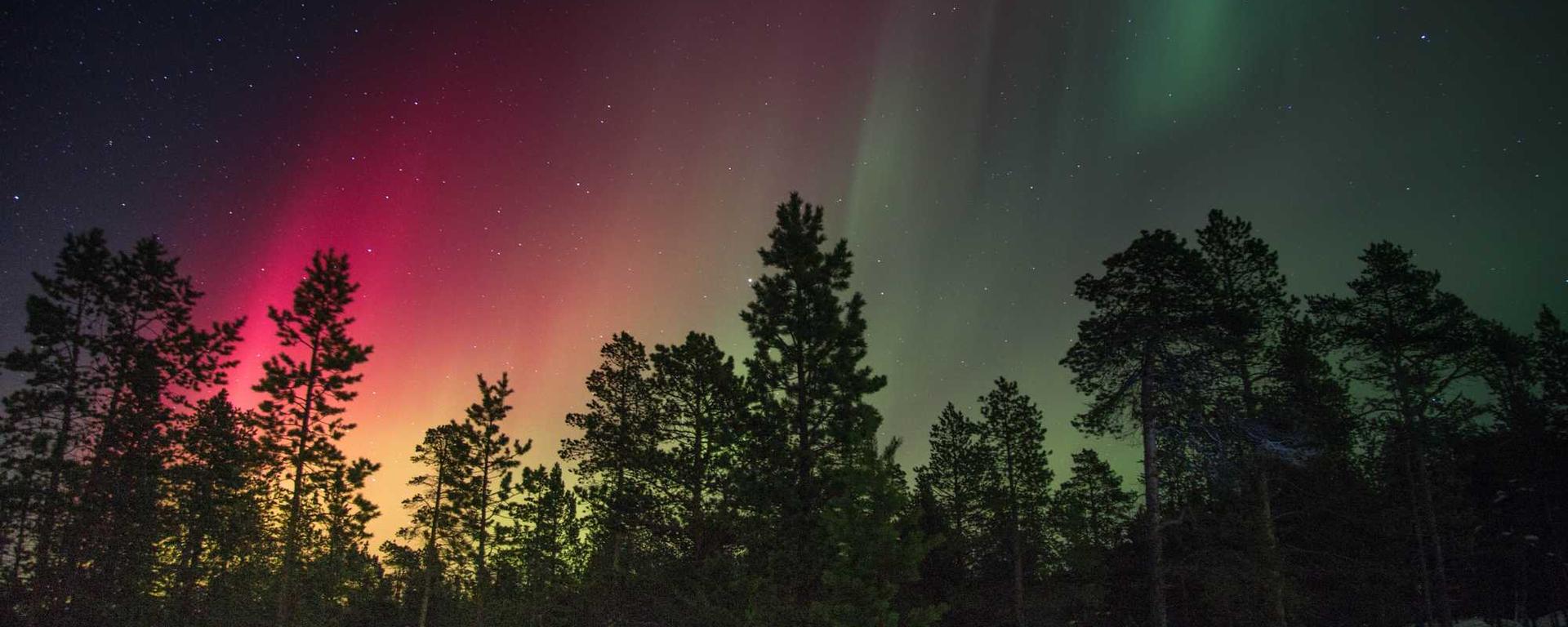
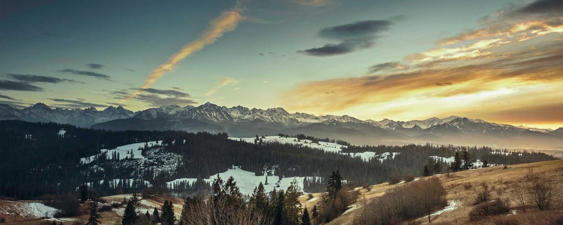
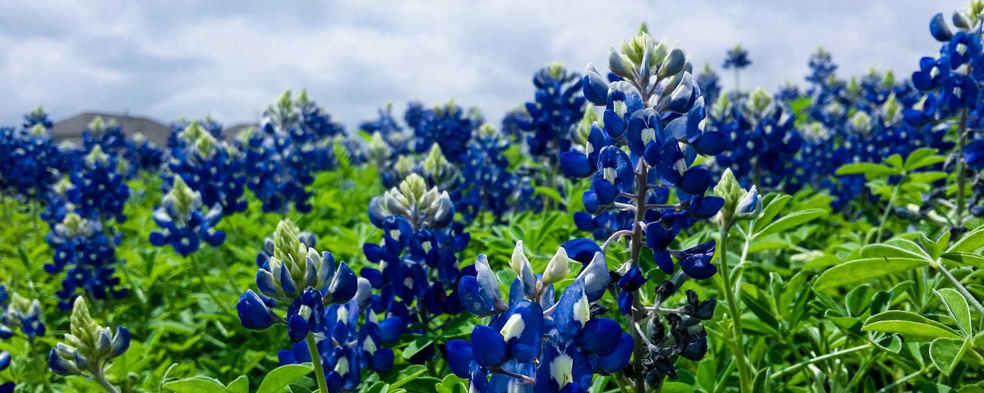
This builder will allow you to generate a custom version of the Carousel component.
The component will show up in between the pink lines below. The pink lines will not show up in production -- they are only used to allow you to view margins and paddings.
In the case of specialized components (things that are meant to be invisible or have a fixed location), the component may not display in this area.
Make the component expand to full width even inside a container
(attribute)
Move the text content to be over the image on wider viewports
(text attribute)
Time in seconds for each slide, defaults to 10.
(text attribute)
Set the actively shown slide.
(text attribute)
Accessible name for the whole carousel. Defaults to "Highlighted Content".
(text attribute)
CSS height for the carousel images. Defaults to 500px.
Custom CSS Variables and Styles (advanced use only)
Font for the carousel text content [default: var(--il-font-sans)]
Carousel image height [default: 500px]
Background behind the carousel [default: #fff]
Height of the controls area [default: 80px]
Height of the controls area [default: 46px]
Background of the controls area [default: var(--il-storm-lighter-4)]
Width of the progress bar [default: 300px]
Width of the progress bar [default: 160px]
Height of the progress bar [default: 10px]
Progress bar base color [default: var(--il-blue)]
Progress bar base color [default: #fff]
Color of the progress [default: var(--il-orange)]
Spacing between slide number tabs [default: 10px]
Spacing between slide number tabs [default: 2px]
Spacing above slide number tabs [default: 10px]
Play button height [default: 40px]
Play button font [default: 400 2.125rem/0.8 var(--il-font-sans)]
Slide number tab height [default: 32px]
Slide number tab width [default: 32px]
Slide number tab font [default: 700 1.188rem/1.5 var(--il-font-sans)]
Slide selection buttons hover background color [default: var(--il-orange)]
Slide selection buttons hover foreground color [default: var(--il-blue)]
Control buttons border width [default: 2px]
Control buttons border width [default: 5px]
Control buttons background color [default: var(--il-blue)]
Control buttons foreground color [default: #fff]
Control buttons border color [default: var(--il-blue)]
Control buttons hover background color [default: #fff]
Control buttons hover foreground color [default: var(--il-blue)]
Control buttons hover border color [default: var(--il-blue)]
Control buttons active background color [default: var(--il-orange)]
Control buttons active foreground color [default: var(--il-blue)]
Control buttons active border color [default: var(--il-blue)]
Height of the previous/next buttons [default: 160px]
Width of the previous/next buttons [default: 46px]
Background of the previous/next buttons [default: var(--ilw-carousel--button--background-color)]
Fireground of the previous/next buttons [default: var(--ilw-carousel--button--foreground-color)]
Border width of the previous/next buttons [default: 2px]
Border color of the previous/next buttons [default: var(--ilw-carousel--button--border-color)]
Line height of the previous/next buttons [default: 1]
Font size of the previous/next buttons [default: 1rem]
HTML listed here
This parent has a style of that is not figured into the source HTML. You can change this by opening the Custom CSS Variables and Styles and editing the parent style.