Web Toolkit Builder
Branded building blocks for the web, with emphasis on accessibility and ease of use.
Who is the toolkit for?
Anyone using HTML to build campus websites can benefit, whether it's building a theme for a CMS or a static website.
Using the Toolkit
Learn how to include the toolkit components in a website and how to customize them.
Looking for the previous Toolkit version? Toolkit v2 Builder
Components
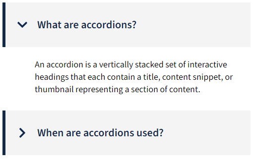
Accordion
Reduce the need for scrolling with collapsible accordions.
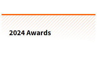
Award List
Highlight awards with categories.

Back to Top
Provide a way to scroll back to the top of the page.
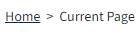
Breadcrumbs
Help users navigate the website's hierarchy.
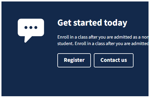
Call To Action
Prompt users to perform highlighted actions.
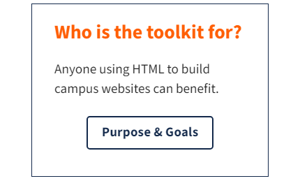
Card
Organize content using cards, with image and icon support.

Carousel
Highlight multiple pieces of content.
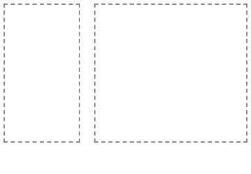
Columns
Lay out content using columns.
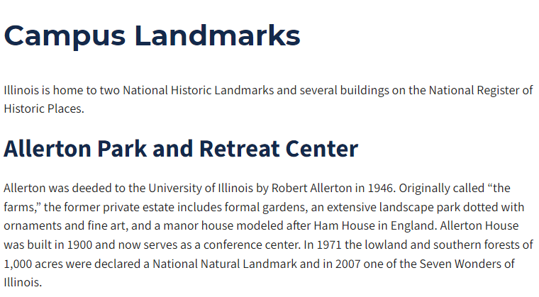
Content
Display content with standard styles.

Content - Inset
Display styled content inside other components.

Content - Introduction
Introduce your content with stylized text.
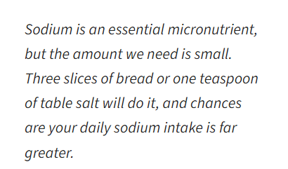
Content - Lede
Style a summary or opening paragraph.
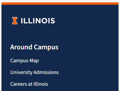
Footer
Create a thematically unified footer navigation for university websites.
Global Button Group Styles
Use standard styling on a button group.

Global Button Styles (anchor)
Turn a link into a button.

Global Button Styles (button)
Use standard styling on a button.

Global Image Cover
Cover an entire element with an image.

Global Screen Reader
Add textual context for assistive technology.

Global Table Styles
Use standard styling on a table.

Global Table Styles (responsive wrapper)
Make a table scroll horizontally on mobile.
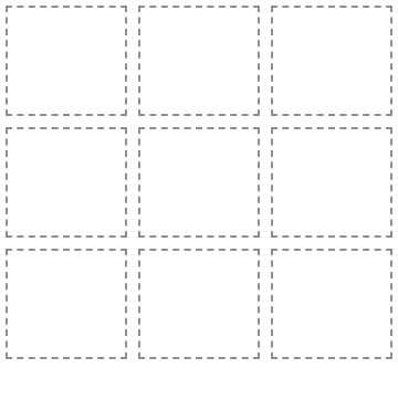
Grid
Organize elements in a grid.
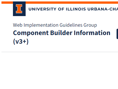
Header
provide branding and navigation for Illinois websites

Header Mega Menu
Build a mega menu navigation
Header Menu
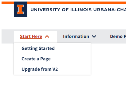
Build a navigation menu
Hero
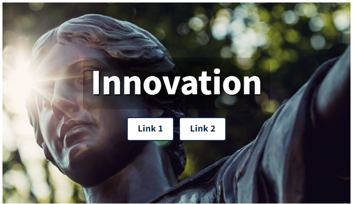
Draw a user's attention, set the page's tone.
Icon
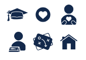
Use the campus icon library.

Icon Panel
Highlight information with an icon and text.

Image Gallery
Thumbnail display of images in a grid

Input
Form elements.

Modal
To provide a modal window to open content on top of a web page.

Org Chart
Build an org chart
Page
Use a standard layout for a page.

Page Title
Add a stylized page title with an image.

Pagination
Provide easy navigation for paged content.

Profile
Person information
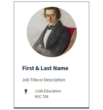
Profile Card
Display a member profile with contact info.

Profile List
Build a profile

Quote
Highlight a quote or testimonial.
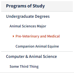
Section Nav
Add secondary navigation for a set of pages.
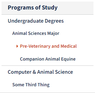
Section Nav - Manual
Create a secondary navigation without automatic list elements.

Spacer
Add vertical spacing between components.
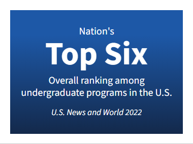
Statistic
Create a statistic.
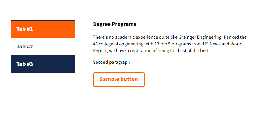
Tabs
Show content in a panel with tab navigation.

Tooltip
Popup that provides info when a user hovers over a button or link
Video
Make a video embed responsive.
Video Short
Make an embedded YouTube short responsive.
Questions? Suggestions?
Get in touch on Teams, or create a Github Issue.