Testing Toolkit Components
These are the components in the toolkit. You can use this page to run against automated tests.
Component: Accordion - 1.3
This is an accordion where you have headers and each header can be opened to display more information.
What are the admission requirements for enrolling in a degree program?
To enroll in a degree program, you typically need to meet certain admission requirements, which may include:
- A high school diploma or equivalent (e.g., GED)
- Satisfactory SAT, ACT, or other standardized test scores (if required)
- Completion of prerequisite courses, particularly for specialized programs (e.g., math and science courses for engineering)
- Letters of recommendation, a personal statement, or an admissions essay
- A minimum GPA requirement, which varies by program and institution
How do I submit my application?
Applications are usually submitted online through the university's admissions portal.
When is the application deadline?
Application deadlines vary by program, so check the specific dates on the university’s website.
Component: Award List - 1.0
Stylized list of awards with categories.
2024 Awards
Winners
-
Grand Prize
Kyle Timmer
"A Biomimetic Scaffold to Improve Rotator Cuff Shoulder Repair" (Chemical & Biomolecular Engineering) -
Design Award
Andrew Freeman
"Breaking the Ice: Fast and Reliable Aircraft Wing Deicing" (Electrical Engineering)
Finalists
-
Satinderpal Kaur
"Flooding, Food Security and Plant-insect Interactions" (Entomology)
Component: Back to Top - 1.2
The Illinois component back-to-top allows you to provide a simple way to skip either to the top of a page or to a designated point in the page (such as the page content area). You can choose alternate Illinois brand colors and adjust the position of the arrow.
Component: Breadcrumbs - 1.3
The breadcrumb component provides a list of formatted links that provide the path between the site’s home page and the page the reader is currently viewing.
Component: Call To Action - 1.2
Call to action component to prompt visitors to perform an action or a few related actions.
Get started today
Enroll in a class after you are admitted as a non-degree student. Enroll in a class after you are admitted as a non-degree student. Enroll in a class after you are admitted as a non-degree student.
Component: Card - 1.3
A card component that can be used as a container for grouping information.
Student Life
Animal sciences students extend their learning and career networks beyond the classroom through internships.
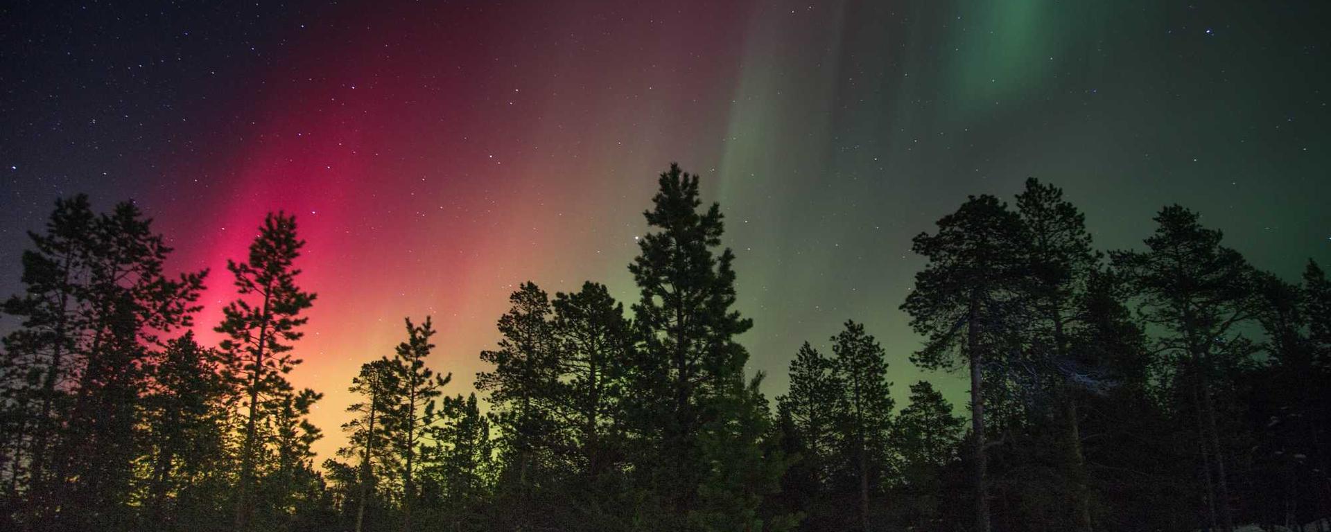
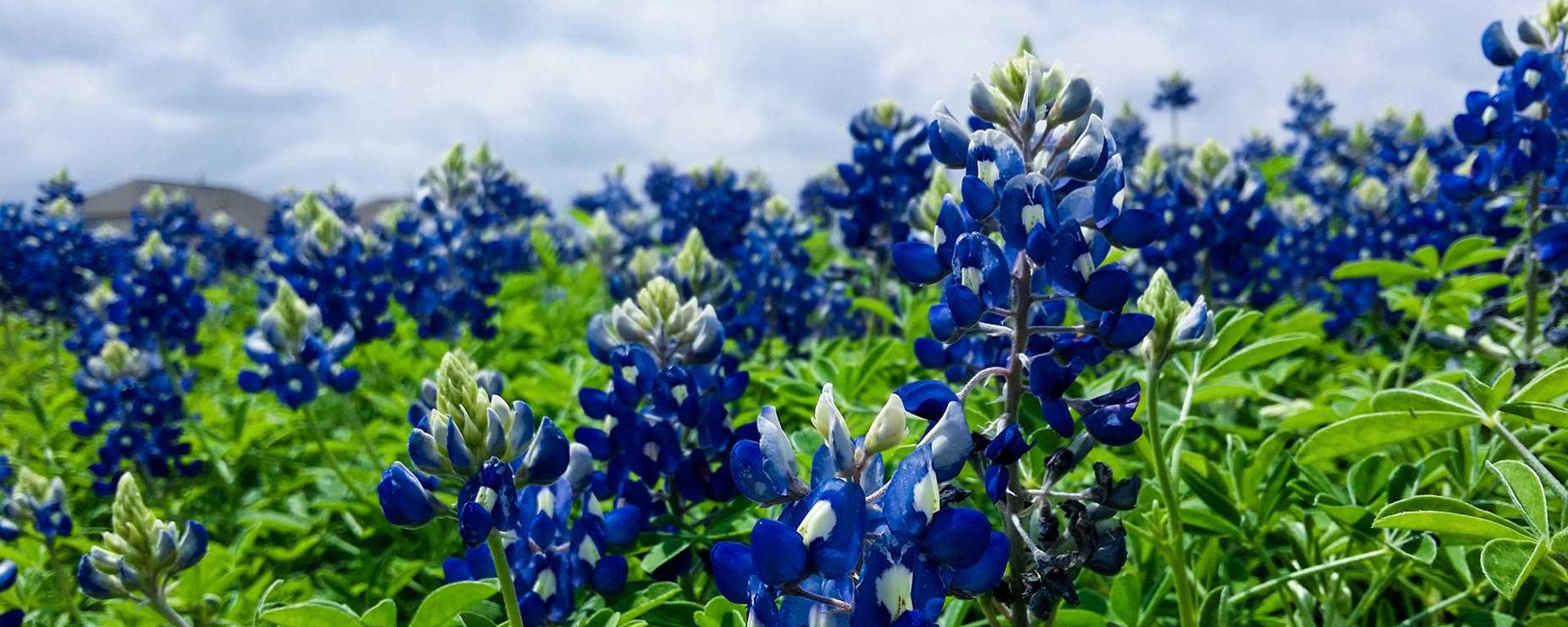
Component: Carousel - 1.2
An accessible carousel.
Northern Lights
Also known as aurora borealis, they illuminate the sky.
Tundra
Tundra is a type of biome where tree growth is hindered by frigid temperatures and short growing seasons.

Blue Flowers
Clusters of blue flowers with vivid colors.
Component: Columns - 1.3
Creates a single row of items that you can use to display information, with information of different widths.
Lorem ipsum dolor sit amet
Consectetur adipiscing elit.
Lorem ipsum dolor sit amet
Nunc sed leo arcu. Nulla non eleifend sapien.
Component: Content - Inset - 1.3
The Content component with the inset mode enabled
Join Us at Whispering Pines College
Discover a place where academic excellence meets natural beauty. At Whispering Pines College, your journey toward a brighter future begins in the heart of the forest. Embrace the spirit of exploration, innovation, and community that defines us. Come, write your story among the pines.
Component: Content - Introduction - 1.3
The Content component with the introduction mode enabled
Discover your path, define your future.
No matter what path brought you to ACES, we're glad you're here. A strong education is just a stepping stone to all of the incredible opportunities that await you.
Join us in changing your future and the world when you accept your ACES admission.
Component: Content - Lede - 1.3
The Content component with the lede mode enabled
Sodium is an essential micronutrient, but the amount we need is small. Three slices of bread or one teaspoon of table salt will do it, and chances are your daily sodium intake is far greater.
Component: Content - 1.3
The Content component, used to display formatted content.
Education Overview
Education plays a vital role in shaping individuals and societies. It provides knowledge, skills, and critical thinking abilities.
Primary Education
Primary education is the foundation of learning, where students develop basic literacy and numeracy skills.
Secondary Education
During secondary education, students expand their understanding across subjects like science, mathematics, and literature.
Higher Education
Higher education includes universities and colleges that offer specialized knowledge and professional training.
Online Learning
With the rise of technology, online learning platforms provide flexible opportunities for students worldwide.
Lifelong Learning
Lifelong learning encourages continuous development beyond formal education.
Key Subjects
- Mathematics
- Science
- Language Arts
- Social Studies
Steps to Academic Success
- Set clear goals
- Develop a study schedule
- Engage actively in class
- Review and practice regularly
Sample Course Schedule
| Course | Instructor | Credits |
|---|---|---|
| Introduction to Biology | Dr. Smith | 3 |
| Algebra I | Prof. Johnson | 4 |
| World History | Dr. Lee | 3 |
Component: Footer - 1.4
The standard campus footer should appear at the bottom of every page of a campus website.
Component: Global Button Styles (anchor) - 3.0
The Global WIGG Stylesheet contains styles for a single button. This is using the 'a' element.
Component: Global Button Styles (button) - 3.0
The Global WIGG Stylesheet contains styles for a single button. This is using the 'button' element.
Component: Global Button Group Styles - 3.0
The Global WIGG Stylesheet contains buttons.
Component: Global Image Cover - 3.0
The Global WIGG Stylesheet contains styles to create an image that covers over the entire area of the parent element.
Component: Global Screen Reader - 3.0
The Global WIGG Stylesheet contains styles to make an item visible for a screen reader but not displayed.
Component: Grid - 1.1
Creates a grid of items that you can use to display information.
Lorem ipsum dolor sit amet
Consectetur adipiscing elit.
Lorem ipsum dolor sit amet
Nunc sed leo arcu. Nulla non eleifend sapien.
Mauris
Maecenas a mollis quam, eu venenatis lorem.
Suspendisse
Integer et velit sapien. Cras sed lacus dui. Etiam at malesuada nisi, id faucibus nisi. Vivamus at mi a purus elementum blandit vitae vitae sem. In accumsan quam in nisl rhoncus, sed mattis quam ornare. Etiam velit orci, rutrum sit amet nunc ac, rutrum venenatis est. Nam viverra orci vel purus commodo facilisis. Duis suscipit tincidunt tortor, non iaculis mauris ultricies in. Vivamus tellus enim, congue eget hendrerit sit amet, consequat et mi.
Integer et
Aliquam sodales lorem condimentum pellentesque pretium. Praesent id lacus non lorem pharetra condimentum id quis nisl.
Lorem ipsum dolor sit amet
Consectetur adipiscing elit. Donec posuere dui mauris, eu scelerisque mauris mattis in. Nunc sed leo arcu. Nulla non eleifend sapien.
Lorem ipsum dolor sit amet
Nunc sed leo arcu. Nulla non eleifend sapien.
Mauris
Maecenas a mollis quam, eu venenatis lorem.
Suspendisse
Integer et velit sapien. Cras sed lacus dui. Etiam at malesuada nisi, id faucibus nisi. Vivamus at mi a purus elementum blandit vitae vitae sem. In accumsan quam in nisl rhoncus, sed mattis quam ornare. Etiam velit orci, rutrum sit amet nunc ac, rutrum venenatis est. Nam viverra orci vel purus commodo facilisis. Duis suscipit tincidunt tortor, non iaculis mauris ultricies in. Vivamus tellus enim, congue eget hendrerit sit amet, consequat et mi.
Integer et
Aliquam sodales lorem condimentum pellentesque pretium. Praesent id lacus non lorem pharetra condimentum id quis nisl.
Component: Header Mega Menu -
Mega Menu for the top of the page.
Component: Header Menu - 1.2
Menu for the top of the page.
Start Here Information - Demo Pages
- Components
- Component Preview
Six Seven
Component: Header - 1.5
Branded Header for the Illinois Toolkit
Component: Hero - 1.2
The Hero Image component adds a large picture at the top of the page. It is used to draw attention to the page and can be used to set the tone for the page.
Innovating solutions every year
Component: Icon Panel -
A panel with an icon and some content, like a small call-to-action.
Component: Icon - 1.2
Wrapper to pull the icons from https://cdn.brand.illinois.edu/icons.html and manage state
Component: Input -
Provides classes to style inputs and form elements.
Component: Modal - 1.2
The modal component provides a modal that opens on top of a web page.
Default Modal
Lorem ipsum dolor sit amet, consectetur adipiscing elit. Sed lectus velit, feugiat in lacinia eget, tristique ut orci. Phasellus ut egestas tellus. In hac habitasse platea dictumst.
Component: Org Chart - 1.0
Organization chart web component for the Illinois Web Toolkit.
Lorem ipsum
Component: Page Title - 1.2
The component ilw-page-title provides a background image and gradient overlay options for the text of the title of a particular web page.
Graduate Programs
Component: Page - 1.1
The Page component, containing styles and margins for other components.
Header
Main Section.
Component: Pagination - 1.1
This component provides standardized styles for page counting links (First, Previous, a numbered set of pages with the current page highlighted, Next, and Last)
Component: Profile Card - 1.1
A card component built to show a profile card.

First & Last Name
Job Title or Description
110A Education M/C 708
Component: Profile List - 1.1
A compact version of the profile
Component: Profile - 1.0
A profile of a faculty, student, or staff member with contact information, biography, and other information.
Jane Smith
Job Title, Department
Biography
This statement can either be written in first person or third person. Third person is perhaps more formal and first person more casual and inviting. Sed ut perspiciatis unde omnis iste natus error sit voluptatem accusantium doloremque laudantium, totam rem aperiam, eaque ipsa quae ab illo inventore veritatis et quasi architecto beatae vitae dicta sunt explicabo. Nemo enim ipsam voluptatem quia voluptas sit aspernatur aut odit aut fugit, sed quia consequuntur magni dolores eos qui ratione voluptatem sequi nesciunt.Neque porro quisquam est, qui dolorem ipsum quia dolor sit amet, consectetur, adipisci velit, sed quia non numquam eius modi tempora incidunt ut labore et dolore magnam aliquam quaerat voluptatem. Ut enim ad minima veniam, quis nostrum exercitationem ullam corporis suscipit laboriosam, nisi ut aliquid ex ea commodi consequatur.
Key Professional Appointments
- Interim Associate Dean, College of Education , University of Illinois, Urbana-Champaign
- Sheila M. Miller Professor, Curriculum and Instruction , University of Illinois, Urbana-Champaign
- Professor, Curriculum and Instruction , University of Illinois, Urbana-Champaign
- Professor, Center for Global Studies , University of Illinois, Urbana-Champaign
- Editorial activity , Research in the Teaching of English (Journal)
Component: Quote - 1.2
Displays a quote or testimonial, with optional attribution of author and source.
Either university presses will embrace new technology and offer scholarly content in new forms to researchers and under new business models, or they will follow the music industry and spend all of their resources on trying to protect their territory — unsuccessfully.
Laura Cerruti
Director of Digital Content Development, University of California Press, profiled in Against the GrainComponent: Section Nav - Manual - 1.2
Secondary navigation for a section of a website, without automatic list elements.
Component: Section Nav - 1.2
Secondary navigation for a section of a website.
Component: Spacer - 1.0
This is a spacer component to increase vertical margin between two other components.
Component: Statistic - 1.1
Display a statistic nicely.
Component: Tabs - 1.1
This is a tab component, where you have a bunch of buttons that trigger new content information inside a fixed area.
Degree Programs
There's no academic experience quite like Grainger Engineering. Ranked the #6 college of engineering with 13 top 5 programs from US News and World Report, we have a reputation of being the best of the best. But a lot goes into those numbers. Engaging professors. State-of-the-art facilities. Groundbreaking student resources. Brilliant classmates. Supportive environment. Endless opportunities. Whether you're a first year undergraduate or working toward a PhD, our programs are designed to help you become the engineer you want to be.
Second paragraph
Panel #2. There's a link that goes somewhere here.
Panel #3
Panel #4 There's a link that goes somewhere here.
Component: Tooltip - 1.2
Popup that provides additional information about a button or link when the mouse hovers over it
Component: Video Short - 1.2
Responsive video wrapper for Illinois Toolkit proportioned for YouTube shorts.
Component: Video - 1.2
Responsive video wrapper for Illinois Toolkit. This component ensures a consistent size and aspect ratio across breakpoints, but does not supply the video element or its controls.